| 4/16/21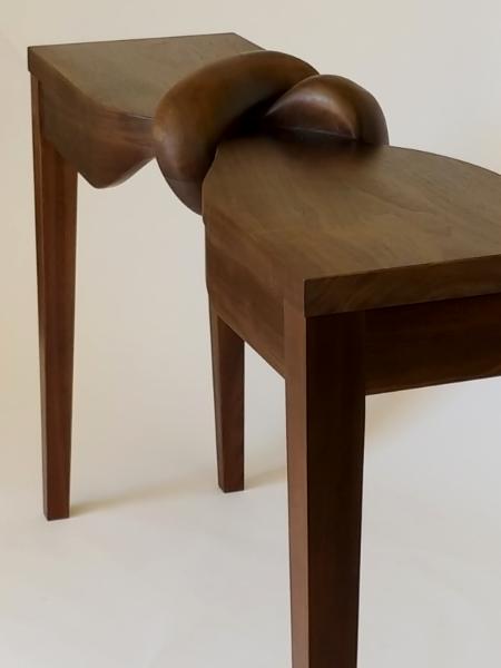 |
This table has generated diverse
interpretations from fans. That's great. I've also been asked about
my inspiration. Here is the story about how it came to be.
I finished this table in May of 2019.
There was a lot going on then as you may recall. We had a President
who totally altered the norms of behavior, calling people names,
lying constantly, cozying up to dictators, promoting conspiracy
theories, and so forth. But it didn't just end with this man. It
spread like Covid to others, such as the pundits on Fox and,
seemingly, half of America. Then there were the policy decisions.
Denying the global warming issue and pulling out of the climate
accord. Separating children from their parents at the border.
Sabotaging environmental protections. Denying the pandemic and
refusing expert scientific advice. All of these events created in me
an anxiety because of the attack on what is considered normal, a
feeling of dread over where our society was headed, and anguish over
separated families. I needed to make something to express these
feelings. A table was a common thing. It had a
normality to it. Take that common thing and twist it up, tie a knot
in it. It's a visual metaphor of Trumpian society. It's still
recognizable as a table – barely. If we accept Trumpian society as
normal we might as well accept this as the new common form of a
table. As well as being a metaphor of the new
normal, Angst also described my state of emotional being. I'm
not a particularly political person and wasn't predisposed to
commentary on such. But Trump created such angst in me that I had to
express it. Creating this art felt kind of like opening a pressure
relief valve and helped me get back to a normal state of existence.
|
Be the first to post a comment.
|
3/6/17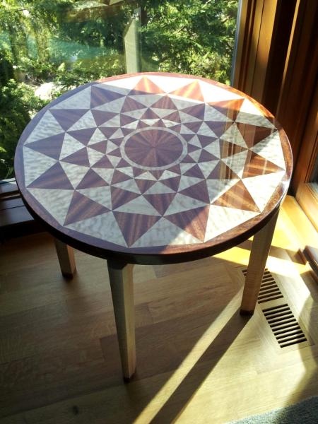 |
I made this table a couple of years ago but didn’t get
around to writing about it because of health issues. It came about because I
had been thinking about doing something to do with a marine theme and also
something “op artish.” I wondered if the
wood textures would add or subtract from the figure and if there would be
enough contrast. Sprials are fascinating and beautiful and all over the
biological world. I first thought of snails and especially the nautilus shell since
I was going after something marine. But, you also find spirals over in the
plant world, such as in broccoli, composite flowers, cacti, pine cones,
etc. I really liked the idea of using a spiral as a symbol of the wonder of the
biological world. Of course, there it is in the night sky (spiral galaxies), so
even better.
I thought of doing a snail or Nautilus
or a sunflower more or less realistically with marquetry, but both images would
really be about the respective creatures rather than the spiral. It wouldn’t be
so symbolic or all encompassing.
I ran across an article on logarithmic rosettes by Paul
Calter [1] and on its connection to the Fibonacci sequence by Dan Reich [2], and
these convinced me to do a logarithmic rosette with 13 points. Calter pointed out that in rosettes based on
the logarithmic spiral all of the dark triangles are similar geometrically as
are all of the light ones. This is a big advantage when cutting wood pieces on
the table saw to make exact fits.
I’m very pleased with the visual aspect of the piece. As you
look at the rosette, your eye (or mind) tries to fill in the missing (light) parts
of the petal figures to create a whole petal (this is called “closure”). But
there are four sets of petals, so your eye (or mind) is constantly moving. This
is the op art part of the piece.
The two woods add to this illusion and keep your eye moving.
The quilted maple (light triangles) exhibits chatoyance, as in Tigers Eye
gemstones, and as you move your viewpoint slightly, the wood appears to move.
The ribbon striped Sepele reflects light in alternating directions from stripe
to stripe depending on your viewpoint as well. So, all in all, I found the
rosette figure to be very intriguing visually and enhanced by the use of these
special woods. I only wish I could show you these dynamic effects in a photo as they are in real life.
[1] Paul Calter, "How to Construct a Logarithmic Rosette
(Without Even Knowing It)", Nexus Network Journal, vol. 2 ( 2000),
pp. 25-31. http://www.nexusjournal.com/Calter.html
[2] Dan
Reich, “The Fibonacci Sequence, spirals and the golden mean”, https://math.temple.edu/~reich/Fib/fibo.html,
Department of Mathematics, Temple University
|
Be the first to post a comment.
|
| 2/23/17 I am excited to be introducing my newest work at the 2017
Camano Arts Association Studio Tour on Camano Island on Mother’s Day Weekend (May
12-14) and the following weekend (May
20-21). I call this series of tables Trees
of Harmony.
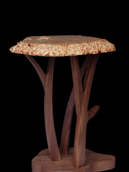 |
I took a more sculptural approach with these tables than in my
previous work, departing from the usual furniture pattern of four legs, apron,
symmetry, etc. I chose to work with
these burls, with their extreme visual and tactile textures, because they made
such a strong connection for me with the natural world. The asymmetrical base completely
fits with the irregular swirls and knobs of the burl and evokes images for me of
tree trunks, roots, puddles, rocks and other natural objects. These table tops have a lot of natural burl edges and burl
surfaces. The textures are really extraordinary,
and the natural burl edge is much more dramatic than the usual “live” edge. If
you like the idea of natural edges -- the sense of being closer to nature or of
being reconnected to nature --I think you’ll really love these tables. To me,
the edges are so striking and so noticeable that they will set the tone for
their area of a home.
I pondered quite a while on the type of base that would be
appropriate for these burls – pedestal vs. four legs, round or square, curved
or straight, metal vs. wood, natural
(like a root) vs. crafted, etc.. None of these in my opinion reached the bar
set by the burls in their natural state. I wanted something that worked in
harmony with the feeling provided by the burls, that maintained and extended
the connection with the natural world, yet I wanted something that would also work
with more typical, refined furniture pieces.
The approach I came up with is an abstract of the tree itself.
In contrast to the edge, the flat part of the table tops
display the exotic, visual burl texture of irregular, spherical swirl patterns.
This exotic wood was the favorite of Kings and Emperors in times past. The live
edge, tactile texture was not. So the two faces of the burl are exposed. The
Yin and the Yang. They work together to
make an extraordinary piece. Harmony.
|
Be the first to post a comment.
|
7/21/14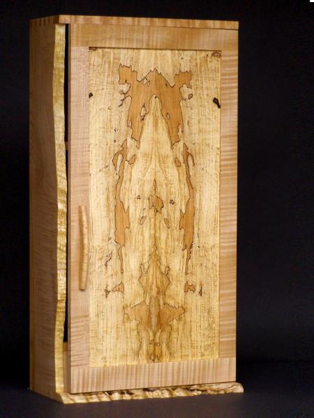 |
I’ve said before that my furniture is about the wood. Many
of my pieces have “imperfections,” such as knots, that would not be acceptable
in mass produced furniture that seeks uniformity, not to mention special
figure, burl and sapwood. These properties make the piece speak of its natural
origins. But natural or “live” edges and spalted wood move the piece even
further in this direction.
Both spalting and live edges are striking visually, as in
this wall cabinet. You don’t really need to go beyond that to justify its use.
However, both characteristics are very symbolic in my mind.
Spalting is caused by fungus. Fungus is an extremely
important part of the ecology of a forest, being essential not only for
recycling biomass but in promoting growth as well. If you look at this detail
of the natural edge of the cabinet, you’ll see tracks made by beetles hosted by
the living tree. So, natural edges and spalting are features that speak not
only of the tree itself as a living creature, but they reference the whole
community of organisms in which the tree functioned.
In this way we see that wood is more than a building material
that has no meaning until we shape something with it, and it is more than just a
beautiful natural product. Wood, and these natural features of wood, are in
fact symbolic of life and community and of our dependence on the natural world.
Mixing the refined craftsmanship of the cabinetmaker and
joiner with natural edges and spalting presents a contrast that just can’t be
ignored. The one is a very utilitarian
and anthropocentric view, the other a poetic and scientific view. That is how
it has always been. We humans have a long history of association with trees, much
of it a utilitarian history. But there is also a long poetic and symbolic
history. However, today many of the world’s forests and the communities they
support are threatened. Including these natural features into our furniture can
help remind us of the origins of the material and of their importance to a
healthy world.
|
Be the first to post a comment.
|
7/21/14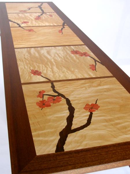 |
Inlay and marquetry can be an extremely effective method of drawing
attention and creating focus, and most importantly for me as designer, a visual
reference or context in which to design the piece. It seems like a traditional
use of inlays in furniture was simply to make a piece less plain, such as
adding a border of Acanthus leaves
might do. I haven’t used inlay in this way for a couple of reasons. First, something
like the Acanthus leaves would have
no particular meaning to me, and second, I don’t think this kind of symmetric
use is particularly effective in creating a focus. Another traditional kind of
piece uses marquetry to create a picture, sometimes so extensive as to obscure
the wood completely. That is something I’m not interested in doing.
What I’ve tried to do is use marquetry or inlay to create a
theme for the piece, focus the eye, and draw the viewer into looking at the
whole design, including the woods. My marquetry and inlay has generally been
asymmetric, high contrast, and organic themed.
A visual reference that has motivated many of my pieces is the
Chinese garden. Sitting in a garden kiosk, you see a plum tree beginning to
bloom or just some leaves framed by a lattice work. The plantings are well
distributed, allowing your eye to focus on just an element of the garden,
framed by the lattice. This was the original
reference that motivated my plum blossom pieces, as in the following Seattle style table.
I like to find ways to connect the visual reference for the
marquetry with the structure of the piece. For example, in the Plum Blossom cabinets,
I am able to carry through the visual reference to lattice work in the
marquetry to an actual lattice work in the apron of the base.
In the Ginkgo console table, my visual reference was the
yellow, windblown leaves of the Ginkgo in Fall. I have two Ginkgo trees, and in
November we have lots of wind, so it wasn’t hard to come up with this idea. I
make the Ginkgo leaves to look like they’re flying in the wind, but they still
have that unique fan shape of the Ginkgo.
But even though these were my immediate references in
designing the marquetry, I love being able to incorporate symbolism into my
pieces. The dogwood and plum blossoms are a couple of my Spring favorites,
signaling the end of winter and beginning of a new cycle of life. Other than
incorporating a “broken ice” fretwork, I’m not sure how else you would capture
these feelings in furniture. Ginkgo’s are symbols of health, life and
endurance, so I like to have Ginkgos around just for good luck. I make the
Ginkgo leaves out of Cascara wood as well, and Cascara bark produces a health
product, so there is another level of symbolism there.
|
Be the first to post a comment.
|
7/21/14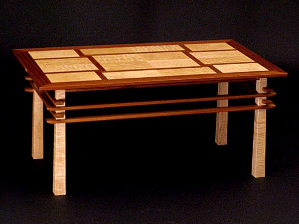
Furniture design is an abstract art form. I don’t approach it
in a “non-objective” way, though. I mean, I don’t try to assemble “elements” of
lines, shapes, colors, textures, etc., to make a pleasing composition without
any reference to the real world. I think
all of my designs have had some visual reference, things such as human and
animal forms, streams, farms, wind-blown leaves, floating leaves, spring time,
and architecture. So, there is usually a “story” behind my designs. I’ll take
architecture as an example.
My inspiration for the “Seattle” line of tables was from the
historical buildings my wife and I visited in China and Japanese architecture
I’ve read about. I was really fascinated with the roofs of some of the
buildings in China. We saw that they were often decorated with interesting carved
figures having symbolic meanings, and I found the repeating rooflines of the pagodas
to be very intriguing. In some of the historical buildings, huge logs functioned
as pillars. These buildings reminded me more of tables than of our western
style buildings.
Playing around with the idea of repeating rooflines, I
finally came up with the idea pictured here. The stretchers overlap the legs
using a shallow cross-lap joint so that the stretcher is much proud of the leg
surface. Judging from the responses I’ve gotten, I think it very effectively
evokes the idea of multiple roof lines, but I also find it an interesting
detail even without that visual reference.
Other elements that refer to the Asian architecture are the
reverse tapered legs (from the log pillars) and the wide overhang of the top
(like some Japanese buildings). However,
the negative space around the stretchers and the straight lines work to keep
the piece looking very light and Western, and I kept the dimensions of the
components modest to enhance this effect and keep the piece looking
contemporary. It really is a fusion of my Western tastes and elements of
eastern architecture, so that is why I’ve decided to call it the Seattle style.
|
Be the first to post a comment.
|
7/21/14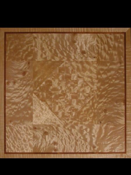 |
Many people ask me if I have a favorite wood. Two actually. Big Leaf Maple and Walnut. We are lucky in the Northwest in having these
two very spectacular species to work with.
Our native maple, Big Leaf Maple, occasionally sports an unusual growth
pattern that gives rise to dramatic figure in the wood called “quilt” and
“curl.” Perhaps one in a thousand trees will have intensely quilted wood. I love to use it in my furniture. Finishing it is an experience. You never know exactly how great the figure
is until you put the final finish to it, and it is exciting to see what you’ve
really got! Sometimes it is breathtaking.
Our other spectacular species is Claro Walnut, a species
native to the San Joaquin valley in Northern California. It is used extensively
as rootstock in California and Oregon for English Walnut. Claro is a deep rich brown marbled with
lighter, darker and reddish streaks and can be figured with “curls” as well.
For some people, wood is wood, either light or dark - just a
building material until someone forms something with it. These two woods are
for people with a deeper appreciation for wood. Furniture made out of these
woods is really a celebration of the wonders and beauty of nature, and I think furniture
made with these woods is about the wood.
The icing on the cake, though, is that these are sustainable
woods. Big Leaf Maple grows right through our urban neighborhoods as well as
throughout the countryside, and the commercial value of Claro as rootstock
would seem to assure its continued existence. In an age we are causing the
rapid extinction of so many species, this is critically important.
|
Be the first to post a comment.
|
7/6/14I've finally taken the time to update my website. The old one was too difficult to maintain so I didn't. The Zhibit software seems very easy to use once you get the hang of it, so I think I can keep on top of it now. I hope, anyway. The nice thing about this site is I can have a blog. This will give me a place to respond to questions I've been asked over the years as well as let you know what's cooking right now. |
Be the first to post a comment.
|
7/4/14This Ginkgo table top is made out of figured American Black Walnut. Usually, when I want to make a table with fancy walnut, I go for Claro from Oregon or California because really deep figure is rare in the eastern walnut on the market. This is walnut was very deeply figured as you can see from this figure on the top. |
Be the first to post a comment.
|
Fine furniture, Camano Island, marquetry  |
|